“Here’s the simple truth: you can’t innovate on products without first innovating the way you build them.”
―Alex Schleifer, Airbnb
What is a design System?
"A design system is a comprehensive collection of reusable components, patterns, guidelines, and design principles that are documented and organized in a central repository. It serves as a single source of truth for designers, developers, and other stakeholders involved in creating consistent and cohesive user interfaces across digital products and platforms."
Why is it needed?
Consistency: A design system ensures a unified look and feel across products and platforms.
Efficiency: It saves time and effort by providing reusable components and predefined patterns.
Scalability: It allows for easy expansion and iteration as products evolve.
Collaboration: It promotes alignment and effective communication among team members.
User Experience: It improves the overall user experience through consistent interactions and layouts.
Maintenance and Updates: It provides a centralized repository for assets and documentation, making updates and maintenance easier.
The problems we faced by not having it…
The absence of a design system brings challenges such as inconsistent UI elements and visual styles, redundant efforts in recreating similar components, fragmented design preferences leading to a disconnected user experience, reduced efficiency without reusable components and design patterns, communication issues due to a lack of shared language and centralized resources, and difficulties in maintaining consistent branding across multiple platforms and touchpoints.
Some bad examples of Styling the component. that writing CSS every time for the same button components.
Before implementing a design system, we relied on a single theme page where customers had to fill in six fields for primary and secondary colors, header color, text color, and hover color. This process became confusing and made it challenging to achieve the desired brand theme for the Rocketium campaign.
Managing this thing becomes difficult when creating CSS variables for each component visible below.
and that’s how we were using it.
Over time, Managing these variables has become increasingly challenging. With variable values being changed, it becomes difficult to anticipate all the places where it could potentially break. Consequently, our team has started considering the implementation of an in-house design system to address these issues.
How to choose the right design system for your project?
To determine the appropriate design system for your project, consider factors such as project requirements, platform compatibility, design aesthetics, available resources, and team expertise, ensuring a seamless fit for your specific needs and goals.
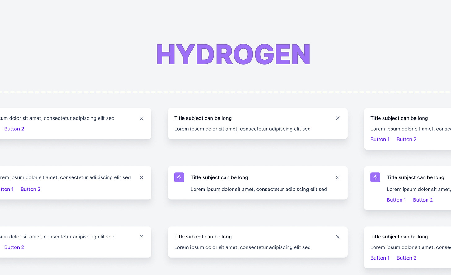
Rocketium Design head Nafees decided to create an in-house design system named Hydrogen.
Implementing
To implement Hydrogen, we opted for the Mantine UI Library due to its close alignment with Hydrogen's style guidelines, ensuring a seamless integration that maintains design consistency throughout the project.
During the setup of Mantine with Hydrogen, we developed a theme engine that simplifies the process by allowing customers to input just one color. The engine then generates 10 shade variations of that color, ranging from 50 to 900.
Mantine's color indexing system, such as primary[6], makes it incredibly convenient to utilize these colors within the framework. This streamlined approach enhances usability and provides seamless integration between Hydrogen and Mantine.
We tailored the Mantine components to align with the Hydrogen design. These customized components were then integrated into the theme object provided by Mantine.
ThemeObject
HydrogenButton.ts
Just Normally use the Button component of Mantine it will automatically will your changes on the button.
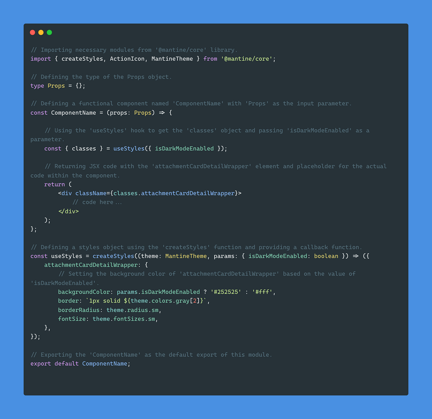
Finally Use this Theme Object in the Mantine Provider. which wrapped a Main App component ( ComponentName.tsx in this case ), because of that theme object will apply to the whole app.
With Mantine you can use Emotion.sh
ComponentName.tsx
We utilize that theme object to retrieve consistent values for styling across multiple components. This ensures that the look and feel remain consistent throughout the application, and any changes to these values can be managed by the team responsible for maintaining the theme object.
Final thoughts
As a developer at Rocketium, our journey has been an evolution from CSS to SCSS, utilizing CSS variables, and creating styled-components to support dark mode. Our most significant achievement has been the development of our design system, Hydrogen. Seamlessly integrated with the Mantine UI Library, it perfectly aligns with our style guidelines. By customizing components, leveraging Emotion.sh for styling, and establishing a theme object for consistency, Hydrogen has revolutionized our UI development process. The result? Enhanced efficiency, improved cohesion, and an unparalleled user experience that leaves a lasting impression. Our commitment to Hydrogen has truly propelled us forward.


